Crash Bandicoot 4: Time to panic?
Crash and burn
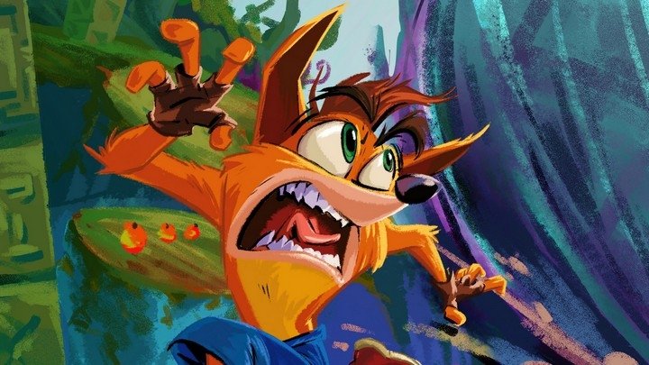
After the announcement of a true follow-up to the beloved Crash Bandicoot series, PlayStation's foremost box-smasher got into my brain and I duly shelled out fifty notes for my right to digitally pre-order this no-doubt masterful marsupial muckabout.
I was therefore delighted to see that a demo had become available for idiotic pre-orderers such as myself! Seems a bit counter-productive to only offer the demo to people who had already committed to buy, thought I, but nonetheless I sat down earlier today and booted up the trial version of Crash Bandicoot 4: It's About Time. And I hated it to death.
Okay, that's a little overboard. But I am very disappointed with what I played. First of all I want to make it clear that I'm well aware this is just a demo and the final version will put these stages in context, and possibly have performance improvements. But sheez-louise this game runs poorly. Yes, I'm using a base PS4, but there's really no excuse. Regular readers know I'm not a framerate guy, but if I'm missing basic jumps because the game's chugging, that's a problem.
Performance is just one issue, though. My main problems are with the design, here; there are so many little things wrong with it that I don't know where to start. The first level in the demo is a snowy stage, which means icy physics. So far, so typical, but then you'll be running on certain ice sheets and they won't be slippery and it throws you off. There's a central mask gimmick in Crash 4, which sees you using special masks on a sort of context-sensitive basis, and in this stage you can temporarily freeze time. This means that basically every jump is a matter of waiting for ice floes to fall over waterfalls then freezing time when they're level with you. It's dull. It's rote.

The problem is obvious from the very beginning, where you're given four incongruous timed boxes to smash using the time-slow mask. This is (it comes to be sadly apparent) indicative of how inorganic the design is in general. Levels reminded me of Crash: Twinsanity, with their small platforms, surplus of boxes (over 150 in each of the levels, here) and finicky enemy placement.
Second stage "Dino Dash" just struck me as derivative of Crash Bandicoot 3's dinosaur-themed levels. The aesthetic isn't exactly the same but it is basically identical in gameplay to the Dino-Might themed stages of its immediate predecessor. Now, what do I expect from a direct follow-up, I hear you ask? And that's a fair point, but I'd love to see the new ideas they've got coming out of their glands applied in a more interesting way, you know?
The last stage in the demo was an ordeal, a finicky and tiresome stage where I took control of Neo Cortex, whose jumps felt weird and weird shooting-puzzle gameplay just wasn't Crash. After my umpteenth death because I couldn't quite hook my jump over an enemy I'd frozen in slightly the wrong position, I had a bit of an uncharacteristic hissy fit and deleted the demo outright, giving some significant thought to cancelling my pre-order. I wasn't happy, Nauties. I was miffed, even.
I won't cancel it. I will see how it shakes out. I think these were mid-game levels and I wasn't anticipating the high difficulty. It's possible and indeed likely that in (Dr Neo) context, these levels will hit me in a better place and I'll be more prepared to throw down. But unfortunately I can't ignore my first impression, and it's not been a good one.
We shall see. More to come, folks.


