Rediscovering the (mostly) lost art of mapping
Few video games experiences are quite so intimate as diagramming a virtual space.
2017 marks the 30th anniversary of quite a few of my favorite NES games, including Metal Gear, Zelda II, The Goonies II, Castlevania II, Metroid, and Kid Icarus. These games all share a single element in common, though it's not an innate element. It's one I imposed on the games externally. Back when I first played through these adventures, I did so accompanied by a tablet of graph paper and a pencil with which to plot out their maps.
Video game strategy guides as we know them today didn't really exist back then, at least not in the U.S. You'd see random pasted-together screenshot charts in magazines, and Nintendo had the Official Nintendo Player's Guide. But that was it. Moreover, those games didn't come with built-in auto-mapping systems, either, aside from the extremely rudimentary overview maps in The Goonies II. The only way to chart your progress in an expansive, nonlinear game was to chart it out yourself, meticulously, on paper.
These games didn't invent that, nor did I. Mapping by hand had been par for the course among PC gamers for years by the time the NES hit the big time. Some of the earliest breakout titles for home computers (and for shared VAX-style computing systems before that) practically demanded to be mapped: Colossal Cave Adventure, Zork, and Wizardry. The latter series couldn't have been more perfect for hand-mapping, in fact. Wizardry consisted of sprawling mazes arranged in a precise grid of passages running in cardinal directions, loaded with hidden doors and bizarre booby-traps. Playing Wizardry without a tablet of graph paper at hand was for those with eidetic memory or a love of utter futility.
These days, of course, games provide their own maps, revealed as you explore. Usually you'll get a local minimap in the corner of the live heads-up display and a full map in a separate screen or possibly as a translucent overlay. It's very convenient, and I doubt many people regret the change. I didn't... at least not until about 10 years ago, when Atlus launched Etrian Odyssey for DS. The hook of Etrian Odyssey, of course, was that it used the DS's lower touch screen as a sort of virtual graph paper on which players had to draw their own live maps of the game, using a palette of mapping tools to customize their creation to their liking. Subsequent Etrian games have included an auto-mapping option, but honestly, it makes the game less enjoyable. The primary appeal of the game comes from the fact that you're not simply wandering a dungeon; you're making it your own.
Etrian Odyssey wasn't (and isn't) for everyone, as the game's love-it-or-hate-it review scores demonstrated. I certainly didn't expect to like it; I only played it because a friend served as the localization editor for the U.S. release and I wanted to check out his work. A few hours later, however, I was absolutely in love with the game. The forced mapping element requires a certain mindset... a mindset that I definitely suffer from. As I mentioned in our recent survey of the metroidvania genre, I love exploring virtual space. Metroid was the game that pushed me from being someone who enjoyed video games to someone who loved them. But I gave up on mapping games after a couple of years, mainly because I had become experienced enough with their workings that I could fairly easily remember my way through virtual spaces without the help.
That recent metroidvania episode jogged some memories, though, and with Metroid's upcoming 30th anniversary, I felt an urge to try my hand at manual game mapping again. It's something I haven't really done outside of Etrian Odyssey in decades, but thinking back on my memories of Metroid reminded me that much of what I enjoyed about that game was the sense of discovery it involved — a sensation heightened by the painstaking maps I made of the game. On a whim, I picked up a graphing notebook with the aim of playing through some Metroid streams while attempting to map the game by hand on camera... and when I started replaying the original Metal Gear again a few days ago in preparation for an anniversary feature, I decided to try mapping it as a sort of dry run for Metroid.

(I'm playing the MSX version of Metal Gear via the Metal Gear Solid HD Collection for PlayStation Vita, incidentally. And I've been sharing my progress as I go on Twitter, if for some reason you're interested in following along.)
I decided to break with tradition and use dot paper rather than graph paper. The dots still effectively define a grid, but they do so in a less intrusive and more flexible way than standard blue-lined quadrille tablets.
It took me a little while to get the hang of this process again; the four rooms I mapped here were pretty quickly scratched out so I could begin working at a larger scale. I initially thought I could use a 2x2 grid space define Metal Gear's rooms — wherein a single screen constitutes a room thanks to the game's rigid, Zelda-like structure — but once I reached more complex areas beyond the opening screens of the Outer Heaven fortress, I realized that even with a 0.1mm pen nib I really need to work 3x3. Live and learn!

It was really on the second (well, technically third) floor of the fortress that the techniques of mapping all came rushing back to me in force. The third floor of Outer Heaven's first building contains a number of diabolical hazards: Electrified floors, rooms flooded with poison gas, man-crushing steel roller traps, and more.
More importantly for my purposes, the third floor also introduces the game's not-entirely-consistent physical placement of interior rooms. That giant black space on the map is where I thought I could make a logical connection between the "outer" halls and an "inner" room... but once I passed through the room I realized that it doesn't quite occupy the same physical space as you might think on the map. Rather than representing a full screen of the map, it's meant to be an abstraction of a smaller space contained within a single screen and actually links two halves of a single fortress screen. This is difficult to explain, but the short of it is: I had to mark out the room and draw it offset in order to make it work. Thankfully, nothing actually occupies that space in the map, so turning it into a dead black void allowed me to press ahead without having to redraw the map.
This, of course, is why most people map with pencils. Oh well.

I'm using ink, though. Which means sometimes I need to use White-Out when I goof.

The wisdom of using dot paper proved itself when I reached the basement of the first building of Outer Heaven. This section consists of six screens (2x3) arranged in a fairly complicated maze that would have been a visual disaster on classic quadrille paper. Here, though, it works OK.
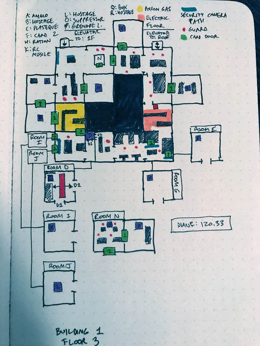
Incidentally, this is what a completed floor looks like. Thankfully Outer Heaven is far more compact than the mazes of many other games. Metal Gear's methodical pacing — it was a stealth game, after all — means you spend a lot more time worrying about the particulars of traversal than in many other games of the era. Each screen in Metal Gear represents a thoughtfully designed self-contained space... though those spaces increasingly interconnect with the surrounding screens as you advance further into the fortress. Pretty lucky for Solid Snake to have infiltrated in the easiest part of Outer Heaven, huh? Almost like it was part of some deliberate plan...
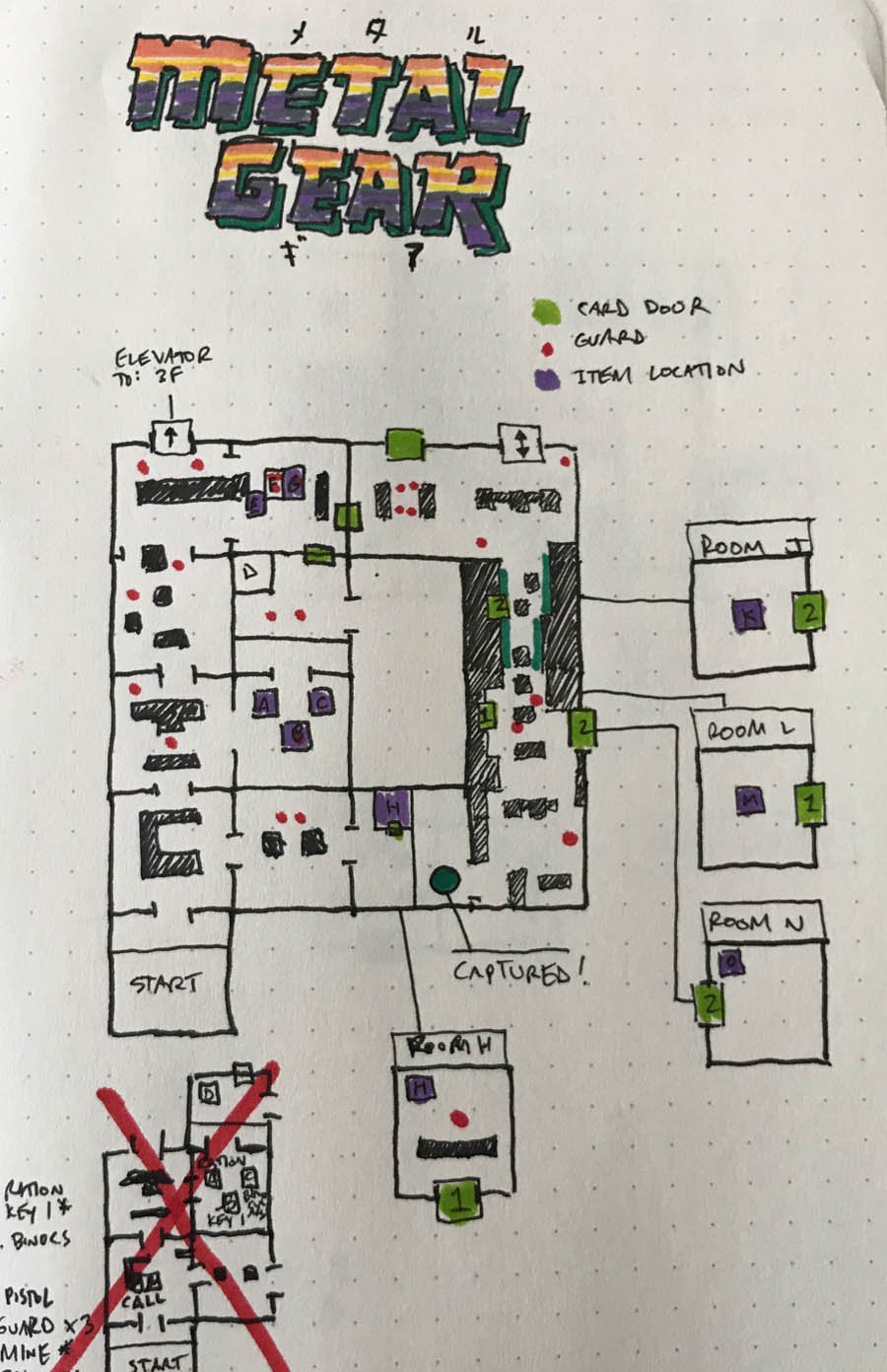
After about two hours of play, I've thoroughly mapped two floors of Outer Heaven (floor 3 in its entirety, and everything on floor 1 except the courtyard) and made partial venture into three other levels: The roof, the basement, and floor 2.
If I were playing Metal Gear without mapping the fortress, I'd have made a lot more progress in the space of two hours. Taking the time to mark down the location of doors, the approximate positions of enemies, and making note of hazards and key card requirements slows things down a great deal. I could just as easily have loaded up a full set of screenshot maps from vgmaps.com and probably be most of the way through the game by now.
That wasn't the point of this exercise, though. Rather, I hoped to revisit a bygone art... and what I've found in doing so is that the process of mapping a game like this changes the overall experience. Yes — obviously — of course. How could it not? I'm playing at about half-speed, because every time I arrive at a new screen I break out Solid Snake's binoculars to scope out the territory ahead.
But I mean that the experience changes in a more metaphysical sense as well. These tiny digital spaces become much more real when you take the time to put them down on paper. I last played the original Metal Gear about five years ago and breezed through it with the occasional help of internet maps and walkthroughs, but none of it really stuck with me. This time, though, I can glance at a section of map and recall precisely what's in that space and how to slip through it. I feel connected to Outer Heaven in a way that doesn't happen a lot with games that feature an auto-map.
In no way am I suggesting games shouldn't feature auto-maps, or that we should chart our progress by hand in new games — that's ridiculous. But there's something deeply satisfying, almost therapeutic, about mapping game worlds by hand. It's the core appeal of the Etrian Odyssey series (and something that makes me worry for that series' future if dual-screen gaming vanishes). I don't want to have to map out every game I play, but every once in a while... I think it wouldn't hurt to have some graph paper on hand. Just in case the mood strikes me.

